• Photography
  • Early Photography
  • Blog
  • About
  • Contact

R. A. Mitchell

Photography

  • Photography
  • Early Photography
  • Blog
  • About
  • Contact

Big Visual World

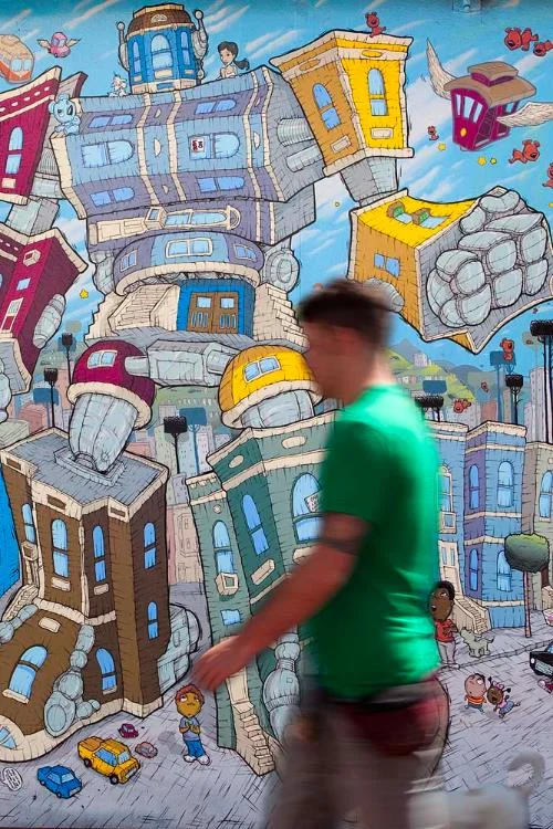
San Francisco, California, 2010, by R. A. Mitchell.

Waiting for my steak and eggs at A Taste Of Heaven in Andersonville at the corner of Clark Street and Balmoral Avenue.  This is currently my favorite regular breakfast spot in Chicago.  I hit it about twice per week.  Diana Ross And The Supremes are singing "Where Did Our Love Go".  My head is down as I edit something tentatively titled “Big Visual World.”  I’m feeling a bit lackluster about the writing, but nonetheless think there might be something there if I can just narrow in on it.  It’s the bouncy beat and the flood of childhood memories invoked by The Supremes that detach my eyeballs from the page and I look up:  I see a sign that reads “Life is Sweet” painted in cursive handwritten letters over some cupcakes, a row of 18 inch X 18 inch quilts, some light blue plates with clouds hand-painted on them, another sign that is cut into the letters that make up the word “Believe”, and on and on.  Country crafts.  Usually dismissed by art aficionados as trite fluff used to fill empty wall space.  This morning though, it’s significant to me.  For a moment, I see each piece as a creation.  Something made from nothing.  There was a time when someone sat down their brush or thread and needle, and put the sign or plate or quilt in good light and took a step back with a bit of a satisfied grin on their face and felt for a moment that they had added something perfectly flawed and beautiful to the world.  They certainly did.

I recently completed a course entitled “Modernism and the Museum” as a part of my masters studies in Modern Art History.  The course description read: “The birth and growth of the modern museum has emerged as a significant institution for the art historian and artist. This course will consider the objects, buildings, and landscapes and think about how their contexts of display influence our understanding of history, education, and the object.”  It was an awesome class and got me thinking and doing lots of good creative stuff.  One of the things I realized when we took a brief look at the relationship between the art museum and public art including street art, is that a lot of (most of) that which is created as an artistic impulse is outside of the purview of the art museum.  It is not considered fine art.  And more than that, it is not considered fine art that has received the blessing of the ivory tower as worthy of our viewership.  Indeed, I believe that folks in the art world are sensitive to, and inspired by the creative impulse and there have been attempts to curate for museums all kinds of crafts and performance and street art, etc.  But these generally have been one off tips of the hat to these art forms and have not become long term investments for conservation and edification.  I acknowledge that there is limitedtime and resources for these things and so we have to prioritize.  And so it is with a good nature that I grant there is too much to put on the pedestal and so we have the gatekeepers that will keep the good stuff in a special place for us all.

Nonetheless as I'm sitting in A taste of Heaven this morning, I feel particularly fortunate that it takes but a look around for me to see really great stuff that will resonate within me if I let it.  (Repeat:  If I let it.)  360 degrees of human creation in the form of hand-painted store fronts and signs, fashion, car design, architecture, landscape design, product design, hand-painted murals and graffiti masterpieces, tattoos, body painting, myriad arts and crafts, ceramics, and on and on.  Indeed it is a big visual world filled with artistic expression.
Saturday 04.26.14
Posted by R.A. Mitchell
 

The Pinky Show - We Love Museums...

Here's a fresh look at the museum.

Saturday 02.01.14
Posted by R.A. Mitchell
 

Guffaw?

I have a question:  Does Art have the ability to have a good belly laugh at it's own expense?  I think it would be overly academic to analyze this as we go and try to add commentary at every twist and turn.  For now, let's simply gather data in the form of pieces that have a laugh at Art. Anything is fair game as the butt of a joke - works, institutions, personalities, ideas, etc.

Tuesday 10.01.13
Posted by R.A. Mitchell
 

Passion

"Bali Stigmata."  Photo of Will Tapper by UK photographer Andy Ford.  Photo found in the "Surf: Worldwide" section here on Ford's Website.

I stumbled across Andy Ford's photography website and the photo above.  When I saw this image I thought of surfing and hands getting raked bloody by coral and about the sacrifices in flesh and blood that we make sometimes for the sake of our passions whether they be sport, recreation, our life's work, etc.  Literalness - both at play and aside - I also thought of the song "Real Live Bleeding Fingers and Broken Guitar Strings" by Lucinda Williams which to me is also about passion.  Much of Andy Ford's photography revolves around the underground music scene in the UK.  Even though Lucinda's music defies genre-classification, it may not fit by sound very easily with the scenes Ford explores.  In spirit I'll bet there are analogies that can be made though.  Rawness and brutal truth are two elements of well used artistic vehicles (visual, musical, literary, and so on) that can articulate beauty and provocation.  I can't help to keep looking at Andy Ford's photograph.

Concerning scars of passion:  As in Will Tapper's gaze above, we at once shudder and are amused by our own ability to sacrifice and endure pain for the sake of quenching a desire or having an experience.

Thursday 05.09.13
Posted by R.A. Mitchell
 

Photography and Identity

Le mont Fuji, by David Favrod.

 As a documentary photographer using the urban landscape as my subject, the photographs I take are of subjects found in place and take advantage of available light. Some documentary photography, especially that which involves people, may involve more arrangement and direction of subjects and lighting, but a sense of authenticity, or “captured as found”, is still often the intent. Crossing over the murky delineations of documentary work and looking at fine art and commercial photography (whether it be portraiture, still lifes, nudes, landscapes, products for advertisements, etc.), arrangement and direction of subjects and lighting may become more important and in some cases the most demanding and costly parts of producing a photograph. The intentions of the photographer are the only guides needed in establishing the level of direction that is appropriate for any given photograph. In other words, “whatever end result I am looking for with this photograph, dictates the level of production used for creating a scene to photograph.”

Recently the Aperture Foundation announced its 2010 Portfolio Prize winner, David Favrod, (here is a link to his website). As an artist, one is always encouraged to follow their instincts.And I believe I do. But it is also worthwhile if not mandatory to look at contemporary work. For me it is always interesting and educational, and sometimes just plain enjoyable, to look at others’ work and see what is being defined as leading the curve. Once familiar with the concept behind Favrod’s portfolio, “Gaijin,” I very much appreciated and enjoyed this fine art work. As it’s foundation is set in exploring identity and as Favrod explains in words and expertly shows in his photography, taking a stab at defining who we are, or what we visualize, as individuals can be rewarding and beautiful. Here is what David Favrod says about his project:

“When I was 18, I asked for double nationality at the Japanese embassy, but they refused, because it is only given to Japanese women who wish to obtain their husband’s nationality.

“It is from this feeling of rejection and also from a desire to prove that I am as Japanese as I am Swiss that this work was created. ‘Gaijin’ is a fictional narrative, a tool for my quest for identity, where self-portraits imply an intimate and solitary relationship that I have with myself. The mirror image is frozen in a figurative alter ego that serves as an anchor point.

“The aim of this work is to create ‘my own Japan’, in Switzerland, from memories of my journeys when I was small, my mother’s stories, popular and traditional culture and my grandparents war narratives.”

I have included in this post one photograph, “Le mont Fuji,” from his prize-winning portfolio above. More of his work can be seen at his website (linked before) and also at this link on the Aperture website. The Aperture Foundation says, “…The purpose of the Aperture Portfolio Prize is to identify trends in contemporary photography and specific artists whom we can help by bringing them to a wider audience. In choosing the first-prize winner and runners-up, we are looking for work that is fresh and that hasn’t been widely seen in major publications or exhibition venues.”

To close out this entry, I want to point out that the exploration of identity - cultural identity or otherwise - that is seen in David Favrod’s work is often complex and takes some sort of form at the intersection of icons from many different cultures and subcultures. Even if that intersection is embraced, or loathed, forced, or artificial, the visual description of it is liberating and edifying by giving tangible representation to something which otherwise often remains amorphous and internally chaotic. This self-informing aspect of art ( whether it be from the visual arts, music, sculpture, architecture, etc.), whether it be high-brow or low, is at the source of my passion for capturing (through photography) hand-painted artwork in the public realm in the urban landscape, whether that be in murals or graffiti masterpieces.


Wednesday 12.28.11
Posted by R.A. Mitchell
 

Negative Space?

Figure 1 - San Francisco, California, 2011. 

Figure 1 - San Francisco, California, 2011. 

Figure 2 - San Francisco, California, 2011.

Figure 2 - San Francisco, California, 2011.

Figure 3 - San Francisco, California, 2011.

Figure 3 - San Francisco, California, 2011.

Above are 3 photographs taken in San Francisco for my Urban Pieces project.  One question that I have about the compositions for this series is how much – if any - of the frame should contain, or be allowed to contain, “negative space” – i.e., not a surface painted with graffiti or a mural, and not a significant component of the urban landscape (I consider people, cars, bicycles, fences, etc., to be significant components of the urban landscape)?  I post the 3 examples above because they illustrate this question relative to the amount of sidewalk that is included in the frame.  While the sidewalk is clearly a component of the urban environment, it doesn't hold the same level of visual interest as the other components I listed above and thus I consider the sidewalk to be negative space in these compositions.  The aesthetics that I’m striving for in this series include dominance of rich colors, brightness, sharp focus, “baroque” complexity of shapes, subordination of identity of people if included, etc.  In moving from top to bottom in the images above, I ask:  am I losing anything relative to these aesthetics as the amount of sidewalk in the frame increases from 0% to about 25-33%?  I’m personally not ready to cut out any of these photographs from the series and indeed I don’t need to yet.  But this is one of the questions I would need to answer if for example I had to edit out one or two of these images.

Friday 12.16.11
Posted by R.A. Mitchell
 
Newer / Older

Powered by Squarespace.